Appearance & Theming
Micold AI IDE uses a single Material Design layout and a shared design system, so every screen — the top app bar, the project view, the known-projects list, and every dialog — shares one consistent look. The application ships light and dark themes, and by default follows your operating system’s preference.
Appearance & layout
The window is organised as a Material Design layout:
- A top app bar across the top holds the application title and its primary actions (including the overflow menu).
- The main area shows either the active project or, when nothing is open, a welcoming empty state inviting you to open a folder.
- Content sits on distinct surfaces (cards) with consistent spacing and rounded corners.
- Buttons follow Material emphasis levels: a filled button for the single primary action, outlined and text buttons for secondary and low-emphasis actions. Buttons visibly respond to hover, focus, and press, and appear dimmed when disabled. They are fully rounded (pill-shaped), as Material specifies.
Depth: how surfaces are separated
Surfaces are told apart by shade and shadow, not by outlines.
Each kind of surface sits at its own level, and the higher it is the lighter its shade (in the dark theme) and the softer and larger its shadow. The window background is flat; cards and the sidebar sit just above it; menus and popovers float higher; dialogs are the frontmost thing on screen and take a notably larger rounded corner.
Outlines are now used for only three things: a divider separating content, the border of an outlined button or text field, and the focus indicator. If you are used to seeing a thin line around cards and menus, that line is gone deliberately — the shade difference and the shadow do that job, which is what makes the interface read as layered rather than as a set of boxed-off regions.
Opening a dialog dims what is behind it. That dimming is now lighter than before, so the content behind stays readable instead of being hidden.
The known-projects list keeps everything it had before — the active-project marker, the “git” badge on repositories, and the “unavailable” state for folders that have moved or been deleted — now presented as Material list items.
The typeface
The application ships its own copy of Roboto and uses it everywhere except the terminal.
This means the interface looks the same on every machine. It no longer borrows whatever UI font your operating system happens to provide, so a window on Linux, macOS and Windows renders text at the same sizes and weights, and changing your OS font setting does not change the app.
Text is set at named sizes drawn from Material Design 3’s type scale — a title, body text and a caption differ in size, weight and line spacing together, so they are told apart by how they look rather than by where they sit on screen.
Two exceptions, both deliberate:
- The terminal keeps its monospaced font and its own character grid. Column alignment in command output is unaffected.
- Text Roboto cannot draw falls back to a font that can. A worktree named in Japanese, or any text using characters outside Roboto’s coverage, renders normally rather than as empty boxes.
The accent colour
The accent colour — used for filled buttons, links, selection and focus — is Material Design 3’s own baseline purple. Earlier versions used a blue.
This changed when the whole palette moved onto Material’s tonal system: every colour is now derived from one seed colour rather than picked by hand, which is what lets light and dark stay in step and guarantees text contrast everywhere. The accent is simply what that system produces. The worktree tag colours shifted for the same reason; each type still has its own distinct, consistent colour.
How the interface responds to you
Every control reacts when you point at it and when you press it, and the two are deliberately different strengths — a press reads as stronger than a hover, so you can tell them apart without thinking about it. This applies to everything you can interact with: list rows, tree items, menu items, chips and tags, and every kind of button.
Selection is distinct from hover. A selected worktree or an active filter chip keeps a persistent, pill-shaped highlight that does not go away when you move the pointer elsewhere. It is a different colour from the hover effect, so “the thing I am pointing at” and “the thing that is selected” are never confused.
Disabled controls are dimmed, including their icons.
Keyboard focus
Text fields and dropdowns show a distinct outline when they hold keyboard focus, so you can see where typing will go after tabbing. The outline stays visible even if the pointer is also resting over the field.
Buttons, rows, menu items and chips do not show a focus outline. This is a known limitation rather than an oversight: the underlying toolkit does not report keyboard focus for those controls, so there is nothing to draw an indicator from. Keyboard navigation between them is not available either, so in practice there is no focus to lose track of.
Automatic light/dark
By default the application follows your operating system’s light or dark setting:
- On launch it matches your current OS theme.
- If you change your OS between light and dark while the app is running, it switches to match within about a second — no restart needed.
Both themes are first-class: the dark theme is fully designed for legibility, not a dimmed version of the light one.
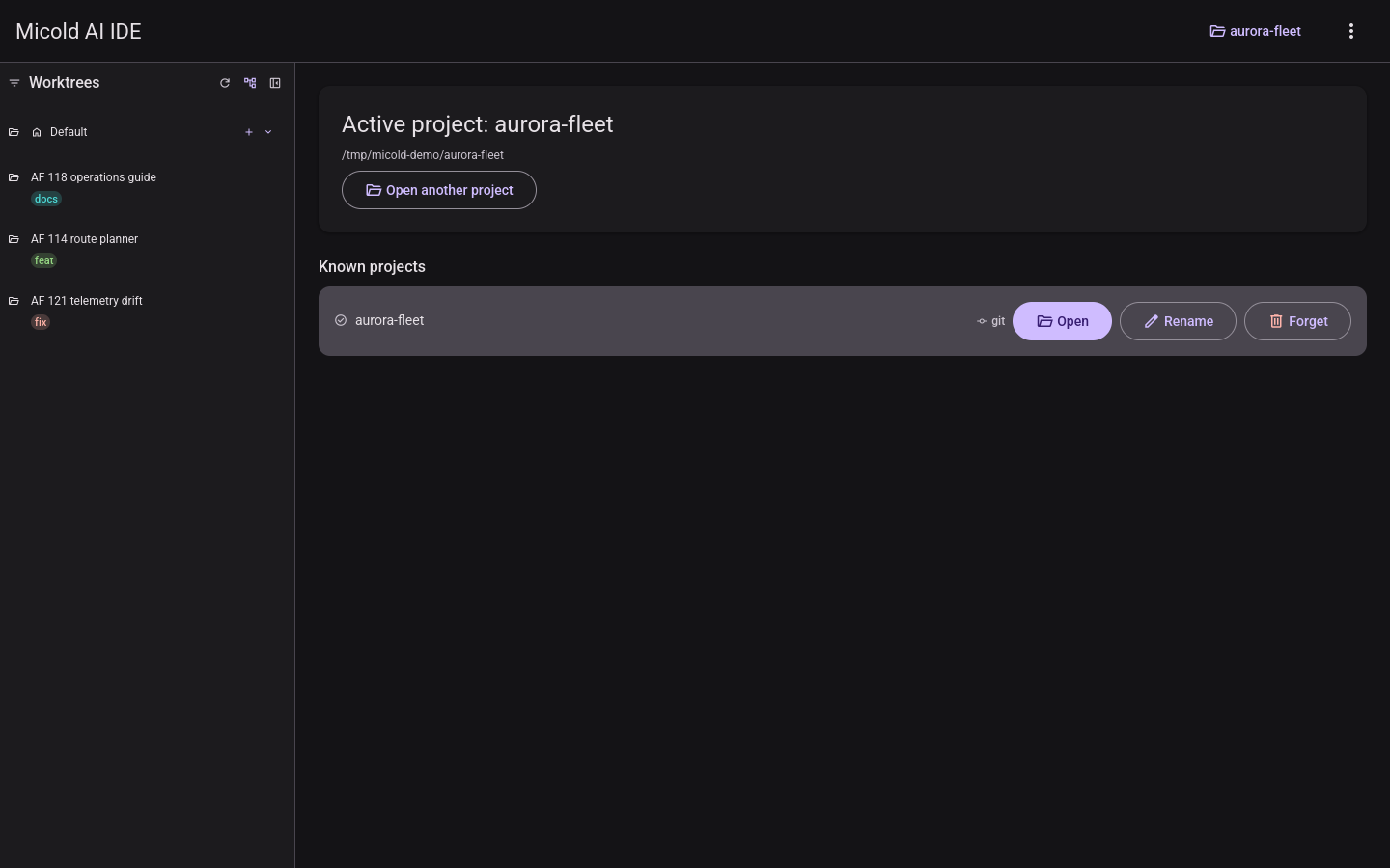
The rest of the application is drawn the same way in both — the worktree sidebar with a session open in it, that session’s terminal, and Settings:
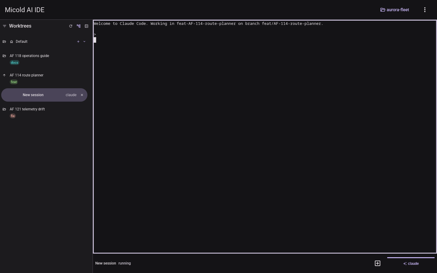
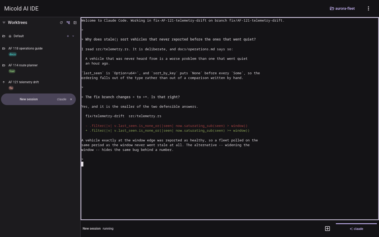
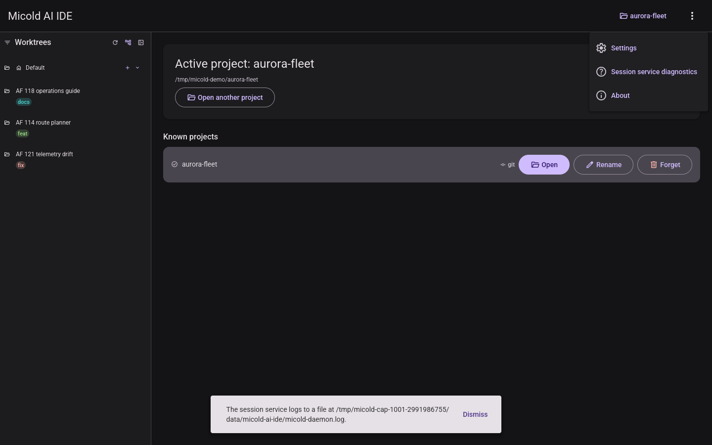
Linux note: OS theme detection uses the XDG desktop portal (with GTK/KDE settings as a fallback). On a session without any of these available, the app cannot read a preference and shows the light theme. Choosing a theme explicitly (below) always works.
Choosing your theme
Open the overflow menu (the three-dots icon on the right of the toolbar). Its first item is a theme-mode toggle showing the current mode with an icon; each click cycles to the next mode:
- Auto (brightness-auto icon) — follow the OS preference (the default).
- Light (sun icon) — always use the light theme, regardless of the OS.
- Dark (moon icon) — always use the dark theme, regardless of the OS.
The cycle order is Auto → Light → Dark → Auto. The menu stays open while you cycle so you can click again. Your choice takes effect immediately and is remembered across restarts. Cycling back to Auto resumes tracking your OS preference and switching live when it changes.
Motion & animations
The interface uses brief, consistent motion so changes feel considered rather than abrupt:
- Dialogs fade in and out. Every dialog — About, the project browser, rename project, add worktree, and Settings — fades and gently lifts into view when it opens (about 0.25 s), and fades back out when you close it (about 0.2 s), whether you close it with Cancel, the Esc key, or a successful Save/Create. As a dialog leaves, the app behind it becomes visible again through the fade, rather than the dialog blinking away in a single frame. (A dialog that reports an error on submit — for example an invalid Settings value — stays open instead, so nothing animates away.)
- The rest of the interface keeps its familiar motion. The overflow menu still fades, the worktree sidebar still slides as it collapses and expands, the main area cross-fades when its content changes, and the sidebar’s resize handle highlights on hover — all unchanged in what they do.
- Things now arrive and leave at different speeds. Every transition eases: it slows as it arrives and speeds up as it goes, rather than moving at a constant rate. Leaving is a little quicker than arriving, which is deliberate — an exit is an acknowledgement, an entrance is a presentation. Larger movements (dialogs, the sidebar) use a more pronounced curve than small ones (menus, hover reveals), so they do not all read as the same movement at different speeds.
- A progress bar no longer claims a percentage. While a worktree is being created the bar’s segment travels across the track instead of sitting at a fixed fill. The app cannot know how far through it is — whether the submodule step runs at all is only known once the branch and worktree exist — so the bar now says “working” and nothing more.
Motion only runs while something is actually moving, so it never adds ongoing background work when the interface is at rest. There is currently no reduced-motion setting.
Notifications
Messages the app needs to tell you about — a worktree that could not be created, a background session that restarted — appear as a small bar near the bottom of the window.
- One at a time. If several things happen at once, they are shown in turn rather than stacking up and crowding the interface. This is a change: previously up to three could be on screen together.
- They clear themselves. An informational message stays about 4 seconds; an error stays about 10, so a failure is not gone before you have read it. Dismiss clears the current one immediately and shows the next straight away.
- Repeats are not queued. Retrying something that keeps failing shows the message once, not once per attempt.
- The connection banner is not one of these. The strip that appears when the app cannot reach its session service reports a condition that is still true, so it stays put until it is not — it does not time out and cannot be dismissed.